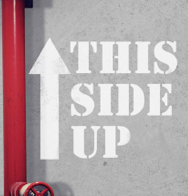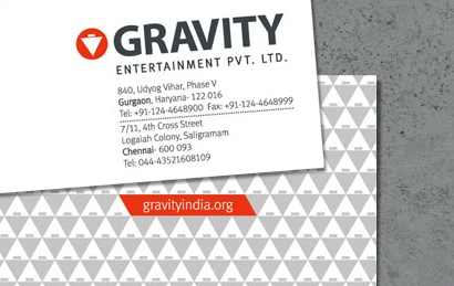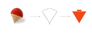


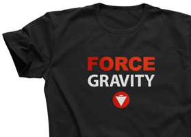
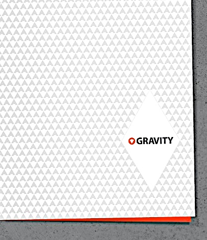

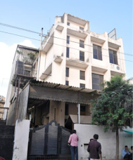
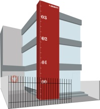
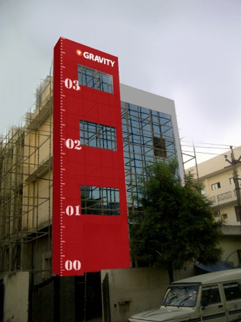
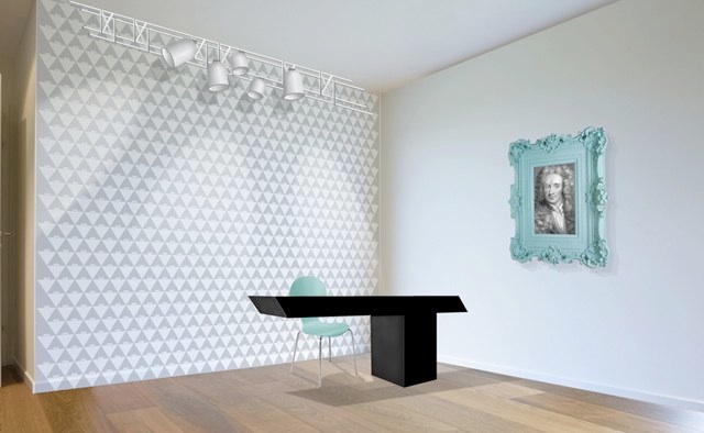
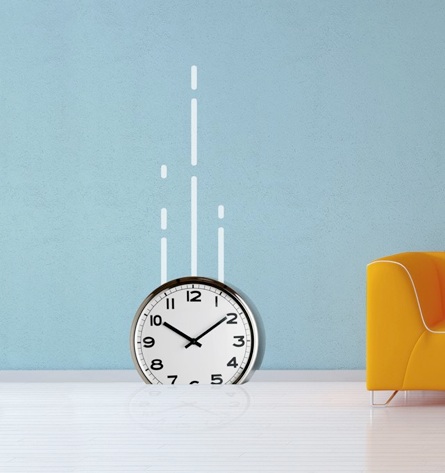
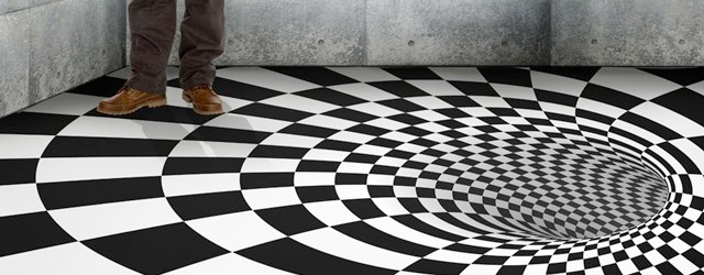
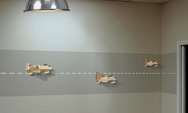
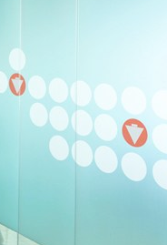
This was a fun experimental project. The new Gravity office, had to be done up without spending much. The attempt was to create a space which would not work with a change of logo. An extension of the identity using inexpensive yet relevant and interesting ideas. The experience is a trip, a trip on Gravity.
WIP